Categories

Computer Science Personal Economics General Mathematics Linguistics Questions Teaching Physics Talks History Theology

Archive

Clustering the New Testament.

During Bible study last week, it was mentioned that people have used statistics to “determine” authorship of books of the Bible. Having a couple free hours last night, I tried my own experiment on the New Testament.

The procedure was easy: I downloaded the Nestle-Aland 26th edition of the New Testament; each book in the New Testament became a vector $v$, with $v_w$ counting the number of times word $w$ appears in the book. The cosine of the angle between two such vectors measured how similar the corresponding books are. I packaged these cosines into a matrix, the $(i,j)$ entry of which measured how similar books $i$ and $j$ are.

Of course, this is a $27 \times 27$ matrix. To turn these numbers into a nice picture, I projected the books onto a lower dimensional space spanned by the eigenvectors having the five largest eigenvalues (this is known as Principal Component Analysis); I chose five dimensions, displayed using location (two dimensions) and color (three dimensions, namely hue, saturation, and luminosity). The result is the following graph:

New Testament Clustering

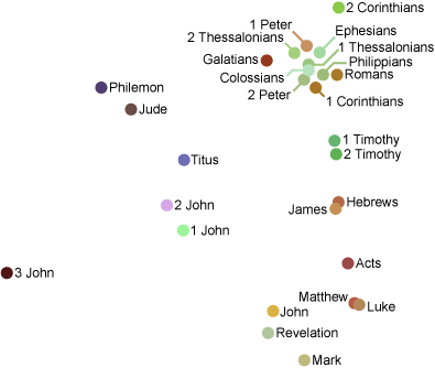
The dots represent each book, and nearby dots of similar colors represent similar books. Some things jump out right away:

  • The Gospels are all in the lower right hand corner.
  • Paul’s epistles (and Peter’s?) are mostly in the upper right hand corner.
  • Revelation is close to John.
  • Hebrews and James are close to each other? Why?

All told, I think this is a pretty good graphical display of the structure of the New Testament, especially considering we used nothing but the Greek text and linear algebra!

Clustering Shakespeare.

I ran my clustering program (which I just ran on the New Testament) on Shakespeare’s plays—which were conveniently packaged into a text file by Open Source Shakespeare.

The result was the following graph:

Clustering of Shakespeare’s Plays

I know little about Shakespeare, so I can’t say too much about the above image. I’d love to know what you think: does this arrangement of his plays make any sense?

Given that modern processors are so good at vector and matrix calculations, I’m surprised that this sort of visualization tool doesn’t appear in more places. For instance,

  • Your blogs and email could be organized this way. Imagine lasso-ing a bunch of similar emails to reply to them all at once!
  • News could be organized into nice piles.
  • Your desktop and personal files could be arranged automatically into relevant piles.

Then again, maybe the idea of piles appeals to me more than most people—just look at how I organize the papers and books on my desk!

Clustering texts with an obvious grouping.

It was pointed out to me by Kenny Easwaran that I ought to try clustering texts that already have a natural grouping.

So I ran the clustering program on 15 texts written by three authors, and here is the result:

Clustering Jane Austen, Shakespeare, and Sir Arthur Conan Doyle.

The largest eigenvalue is 25 times bigger than the next largest eigenvalue, and picks out the author pretty well. The top pile consists of Jane Austen’s books (with Emma split into three volumes). The middle pile consists of Sir Arthur Conan Doyle’s books, with the Sherlock Holmes mysteries (Valley of Fear, Sign of Four, and Hound of the Baskervilles) grouped closer than the others. The bottom pile are five of Shakespeare’s plays.

Of course, these people are all pretty different. As requested below by Theo, let’s run it one more time, using 12 books from George Eliot, Jane Austen, and the Brontë sisters.

Three from the same period.

Well, that didn’t quite work. The books by the Brontë sisters (Wuthering Heights, Villette, The Professor, Jane Eyre) have been separated from the others, but George Eliot and Jane Austen are getting mixed together. Admittedly, if you just project to the y coordinate, the authors are sitting in disjoint intervals. Nevertheless, this isn’t as nice as I might hope; so let’s run it again, just on the eight books written by the two authors that aren’t being sufficiently separated:

Just two from the same period.

I suppose this is somewhat better, though it’s basically just a stretched out and inverted version of the previous image. Jane Austen’s books (Sense and Sensibility, Pride and Prejudice, Mansfield Park, Emma) are all up on top, and George Eliot’s books still aren’t piled together.

You might have guessed that I have Project Gutenberg to thank for the text files (including the Shakespeare plays).

Visualizing pineapple pancakes.

The pineapple sauce pancake graph has English words as vertices, and a directed edge from $a$ to $b$ if the concatenation $ab$ is also an English word. For instance, there is a vertex labeled pine, and a vertex labeled apple, and an edge from pine to apple.

Anyway, the graph is huge; and the usual visualization tool (Graphviz) doesn’t work particularly well on the whole graph, so I took a few hundred vertices around pine, apple, sauce, pan, and cake. The result was the following:

Small pineapple graph.