Categories

Computer Science Personal Economics General Mathematics Linguistics Questions Teaching Physics Talks History Theology

Archive

Political relationships hidden in markets.

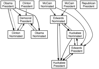
I’m again applying Granger causality to time series data from Intrade. This time, however, I connect box A to box B with a

  • green arrow if A becoming more likely causes B to become more likely, and with a
  • red arrow if A becoming more likely causes B to become less likely.

Shorter arrows suggest stronger relationships (technically, a lower p-value).

Running the algorithm on the market data since January 1, 2008 with a lag of two days produces the following graph:

Two day lag since January 1, 2008

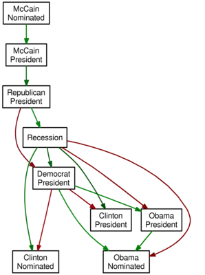
And so, we see that the market data is encoding some

  • tautologies (McCain’s nomination makes him more likely to be president, and McCain’s being president makes it more likely that a Republican is president) but also some
  • conventional wisdom (a recession makes Clinton more likely to be nominated, but Obama less likely to be nominated; perhaps the perception that Obama would fare better in the general election explains the red arrows from “Democrat President” to Clinton, and the green arrows from “Democrat President” to Obama).

It’s amazing to me (and hopefully also to you) that the relationships between the prices of these Intrade contracts manages to encode popular sentiments.

Granger causality and Intrade data.

Granger causality is a technique for determining whether one time series can be used to forecast another; since the Intrade market provides time series data for political questions, we can look at whether political outcomes can be used to forecast other political outcomes.

There’s a library for the statistical package R to do the Granger test, and Intrade produces CSV market data. I fed the market data for various contracts since January 1, 2008 into R, and the output of that into GraphViz to make a nice-looking visualization; in particular, I connect $a$ to $b$ if $a$ Granger-causes $b$ with $p$-value less than 0.05. Darker arrows have smaller $p$-values. This is all an embarassing misuse of statistics and $p$-values, but it is quick and easy to do, and the results are fun to see.

Here is the graph for a lag of one day (i.e., does yesterday’s value of $a$ predict today’s value of $b$):

One day lagged granger causality graph

Here is the graph for a lag of two days (i.e., can the two previous days of data for $a$ be used to forecast the next day of data for $b$):

Two day lagged intrade granger causality graph

And here is the graph for a lag of three days:

Three day lagged intrade granger causliaty graph

Don’t take this too seriously. And one word of warning: an arrow from $a$ to $b$ does not mean that if $a$ is more likely, then $b$ is more likely—rather, it ought to mean that past knowledge of $a$ can be used to forecast $b$. I suppose it would be interesting to add some color for the direction of the relationship, and maybe I’ll do that when I have another free hour.